
 |
| Click here to see it! |
A couple of weekends ago, Charlie and I stopped in at Ikea and used a free, $25 off anything in the store to pick up some white frames that will accent this painting. I am going to put photography I take in them with my new camera. (I was thinking of using sepia nature photos. We'll see where I take it).
Then, tying everything together, I came up with this mood board to see how the room would look with the wall color, Behr's "Lime Light":
 |
| Art: BB&B, Frames: Ikea, Dinnerware: BB&B, Geometric Fabric: Front Door Fabrics and on our dining chairs, Mini Vases: Ikea, Brown swatches: Art Van Furniture fabric and wood colors, Color: Behr "Lime Light" |

My analysis:
Lime Light, the original pick, actually looks okay in the picture, but like I said, it is far too bright in person. More of a bedroom color.
Valley Mist was ruled out almost instantly. It was too in-your-face and very, very bright aqua.
Smokey Slate really caught my eye. I LOVED this color but Charlie hated the way it looked on the computer screen, so he was hesitant to get the sample. I liked how it brought out the green undertones of the painting. However, I worry that, because it's so dark, it will swallow up the room.
Contemplation is a gorgeous color and very mature. I love the way it plays off the painting, and I think it is a great color for two rooms. It wouldn't overhwlem. However, I worry that because it is such a good match with the painting, it will almost loose it's "pop" on the wall...
So what is your vote?
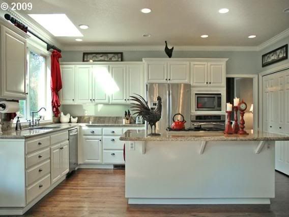
Contemplation:

Smokey Slate:

 |
| Contemplation |
 |
| Smokey Slate |

I love them both but am leaning towards Contemplation. I love the way it looks in that kitchen.
ReplyDeleteContemplation
ReplyDelete